Analysis of the process of appearance of positive faces from Covid 19 in Serbia during September and October 2020
Prof.dr Vojislav Stoiljković vojislav.stoiljkovic@cimlss.rs
Analysis of the process of appearance of positive faces from Covid 19 in Serbia during September and October 2020
The I-MR control chart is used in this appendix to analyze the process of appearance of positive faces.
What is an I-MR control chart?
https://sixsigmastudyguide.com/i-mr-chart/
The I-MR control chart was introduced by Walter Shewart, so the control charts are also called Shewart Charts. The I-MR chart also called the X-MR chart, is a combination of two maps (single and moving range) to track process variability based on samples taken from the process over a period of time.
The single moving range (I-MR) chart is used when data are continuous and are not collected in subsets but only one data for a given period (number of Covid 19 positives in 24 hours). In other words, one cumulative observation is collected for a given day. The I-MR chart provides graphical methods with time changes. The graphical I-MR graph helps identify when a process is spiraling out of control and also indicates where to focus on the causes that can be assigned.
I-MR definition
II-MR chart is basically two separate maps – chart Individuals (I) and Moving Range (MR), the combination of two maps gives a complete picture of the process behavior.
I-Chart: An individual chart displays individual data for a variable (number of positives) and tracks the mean and shifts in the process when data for individual points are collected at regular intervals (for each day). This graph helps to identify common and assigned causes in the process if any.
The MR graph of the moving range monitors the variation of the process when data are collected at regular intervals. In other words, the graph of the moving range follows the absolute difference of each measurement in relation to its previous measurement.
The I-MR control chart is used for:
- Check for any indications of causes that may be assigned in the process that may cause the process to spiral out of control
- Monitoring process capabilities before and after process improvement
- When the rate of the variable being monitored is slow (the appearance of positives on Covid 19 is monitored at the level of one day) and it is difficult to wait for more samples
- Measuring systems are too expensive (such as destructive testing)
- It is mainly used for processes that go in series
An I-MR map is used when the subgroup is only one unit.
For the analysis of the process of occurrence of positive for Covid 19 in Serbia, the period from 12.09.2020 was taken. to 28.10.2020. years. Data on positive citizens on Covid 19 in the mentioned period were taken from https://covid19.data.gov.rs/, where the Trampoline Institute publishes official data. These data by dates are shown in Table 1.
Table 1 Data on the number of positives in the period from 12.09.-28.10.2020.
| Date | Count the positives | Date | Count the positives |
| 12 September. | 72 | 06 October | 120 |
| 13 | 108 | 07 | 121 |
| 14 | 29 | 08 | 151 |
| 15 | 74 | 09 | 173 |
| 16 | 102 | 10 | 168 |
| 17 | 82 | 11 | 102 |
| 18 | 62 | 12 | 67 |
| 19 | 83 | 13 | 153 |
| 20 | 68 | 14 | 245 |
| 21 | 30 | 15 | 203 |
| 22 | 61 | 16 | 265 |
| 23 | 81 | 17 | 227 |
| 24 | 83 | 18 | 214 |
| 25 | 75 | 19 | 122 |
| 26 | 74 | 20 | 326 |
| 27 | 72 | 21 | 512 |
| 28 | 30 | 22 | 416 |
| 29 | 65 | 23 | 579 |
| 30 | 72 | 24 | 757 |
| 01 October | 111 | 25 | 614 |
| 02 | 73 | 26 | 341 |
| 03 | 107 | 27 | 1053 |
| 04 | 59 | 28. October | 1328 |
| 05 | 51 |
The data shown in Table 1 are included in the SPC.net program developed by the CIM Group in the period 1994-2010. years. The main menu for the SPC.net program with a defined analysis of “Nova Covid 19″ is shown in Figure 1 (this figure also shows the analyzes that were done and shown in the books LEAN IN HEALTH (http://www.cimlss.rs/knjige /) and Lean in Healthcare (https://www.amazon.de/Lean-Healthcare-Management-transformation-conditions/dp/6139841437) author of this article.

Figure 1 Basic menu in the SPC.net program
By entering the data from Table 1 into the defined analysis “Covid 19″ (for the period from 12 September to 05 October 2020), the I-MR control chart is obtained, which is shown in the figure. 2.
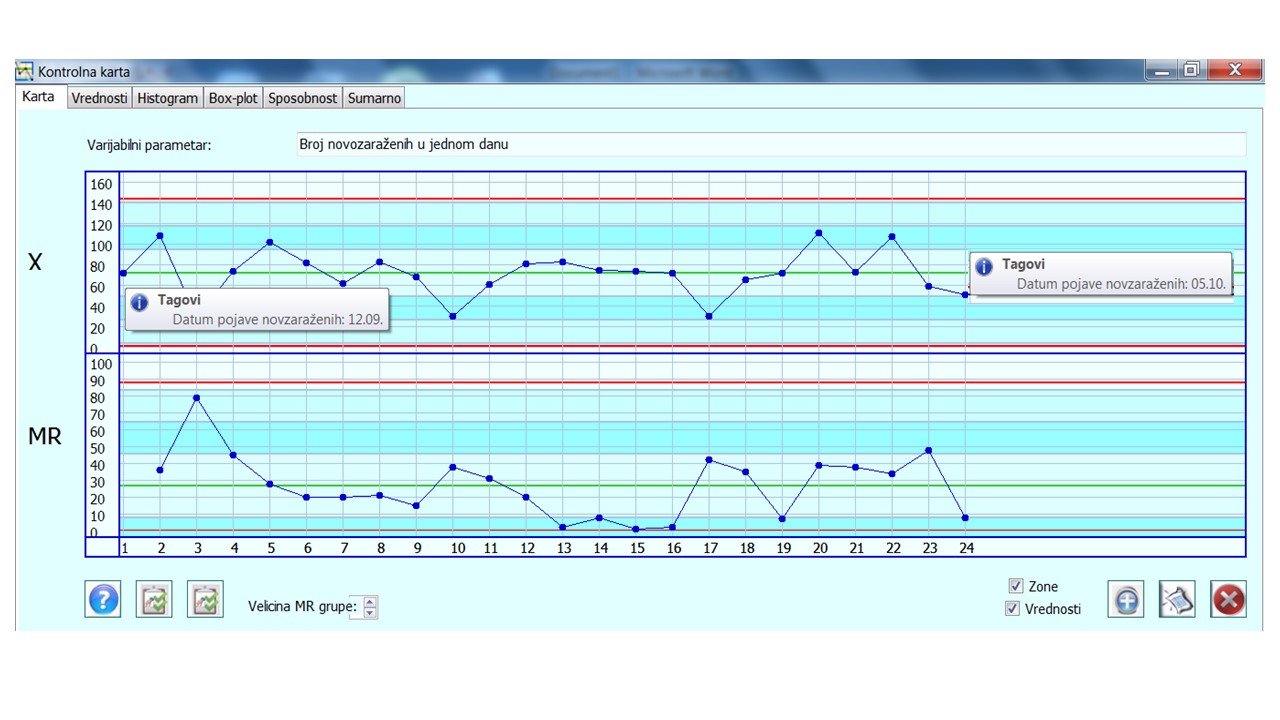
Figure 2 IMR control chart for the period from 12 September to 05 October 2020.
Other analyzes that accompany this control chart are:
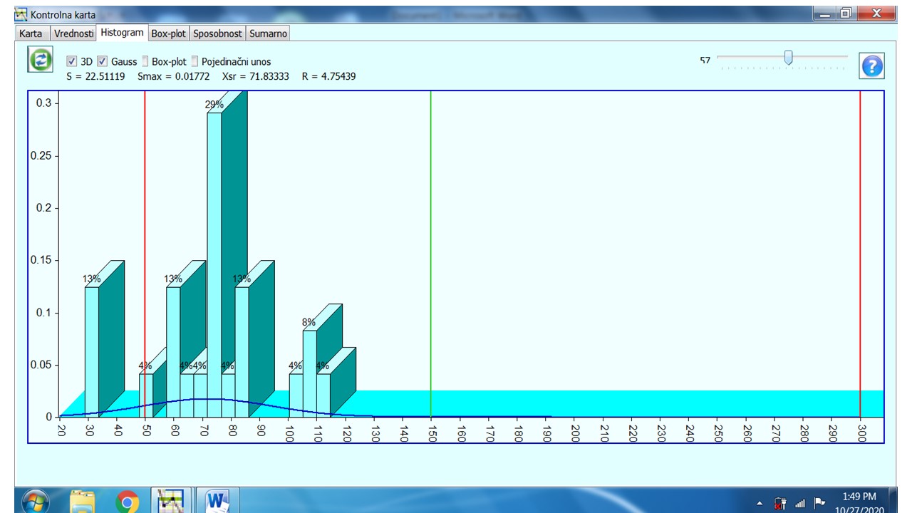
Figure 3 Histogram for the period from 12 September to 05 October 2020.
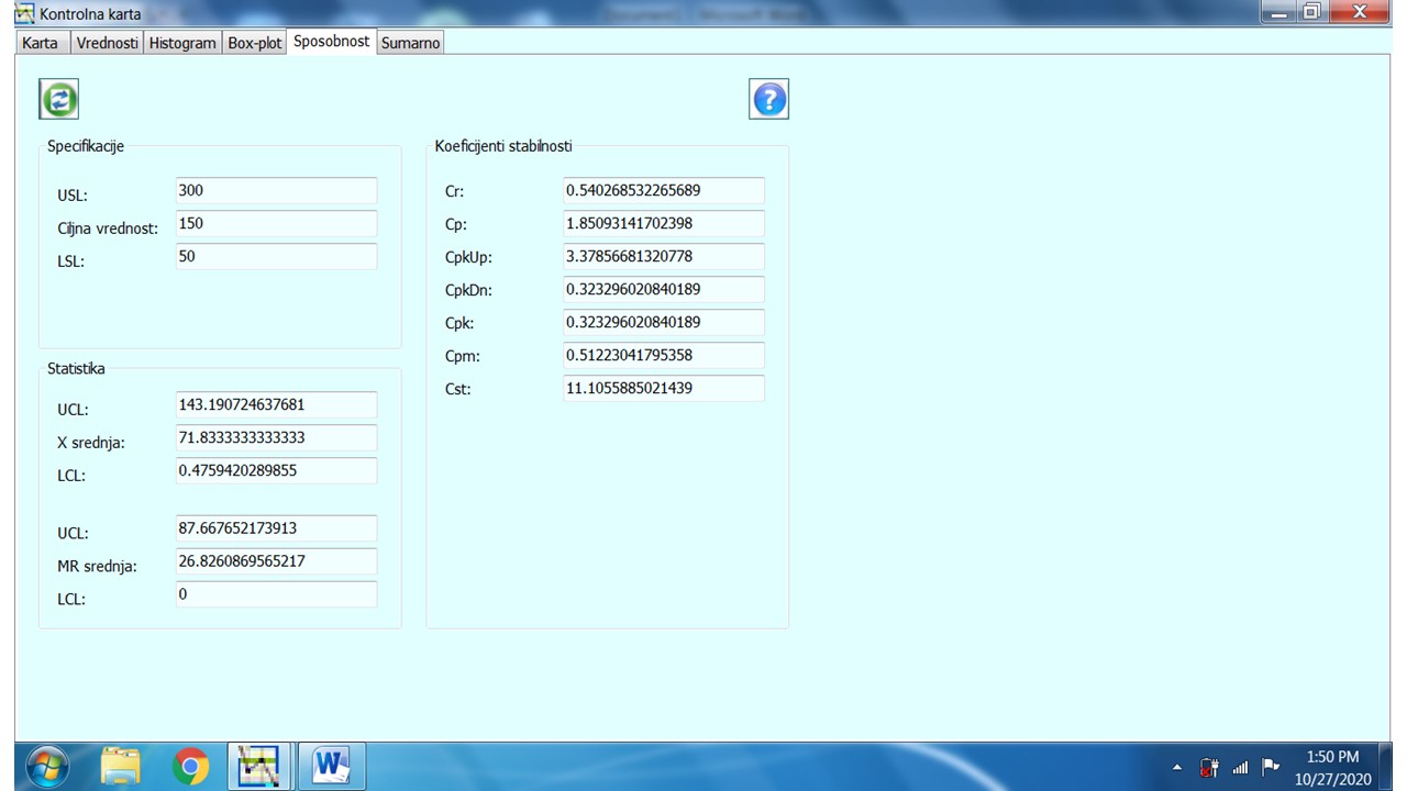
Figure 4 Process capability for the period from 12 September to 05 October 2020.
Figure 5 shows a summary of all analyzes.
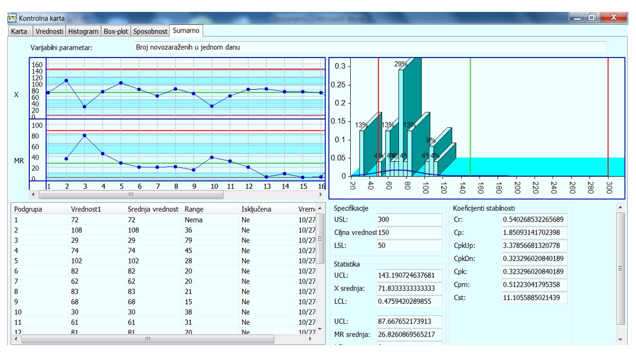
Figure 5 Summary of all analyzes for the period from 12 September to 05 October 2020.
What conclusions can we draw from the presented IMR control chart, Histogram, and data on the ability of the process to appear positive for Covid 19 in Serbia in the period from 12 September to 05 October 2020. years:
- The process is unstable
- Large variation of positives from day to day (see the value for Range in pictures)
- The ability of the Cpk process is only 0.3232, which is extremely low compared to 1.33, which was valid for 70 years of the last century, and especially for less than 2.0, which is valid for Six Sigma process quality.
Process stability refers to the predictability of a process to remain within control limits (process voice). If the distribution of the process remains consistent over time, ie. the outputs fall within the control limits, then the process is said to be stable or in control. If the outputs are located outside the control limits, the process is unstable or out of control.
Process capability is a measure of a process’s ability to meet customer specifications (customer’s voice). The measure tells how good each individual output is. Estimation ppm – part per million (positive per million inhabitants) is a method for measuring process capabilities.
In the case of the process of positive appearance, it can be seen that the process is not stable. The first task of the people responsible for monitoring the process of the emergence of positives is to identify the roots of the causes of such great instability and to propose corrective measures so as to make the process stable. This means that the variation in the number of positives should be within the limits so that the value for Cpk is equal to or greater than 1.33 (http://www.cimlss.rs/stabilnost-sposobnost-i-%EF%81%B3-nivo- process-quality /, http://www.cimlss.rs/stability-capability-and-sigma-level-of-process-quality/). To find the root cause, it is necessary for the Covid 19 monitoring and analysis team to apply the Ishikawa method, which will be discussed in more detail in the second part of this paper..
By entering the data from Table 1 into the defined analysis “Covid 19″ (for the period from 06 October-28 November 28, 2020), the I-MR control chart is obtained, which is shown in figure 6.
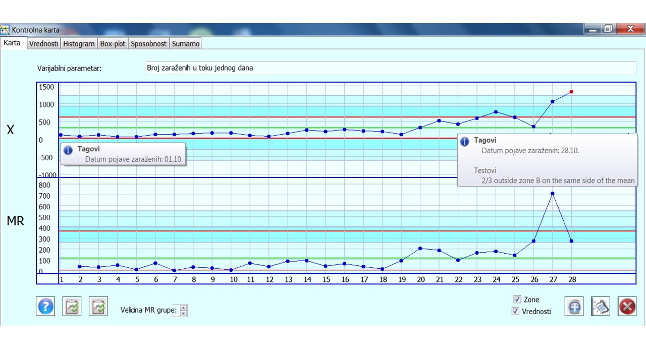
Figure 6 IMR control chart for the period from 06 October-28 November 2020.
Other analyzes that accompany this control chart are:
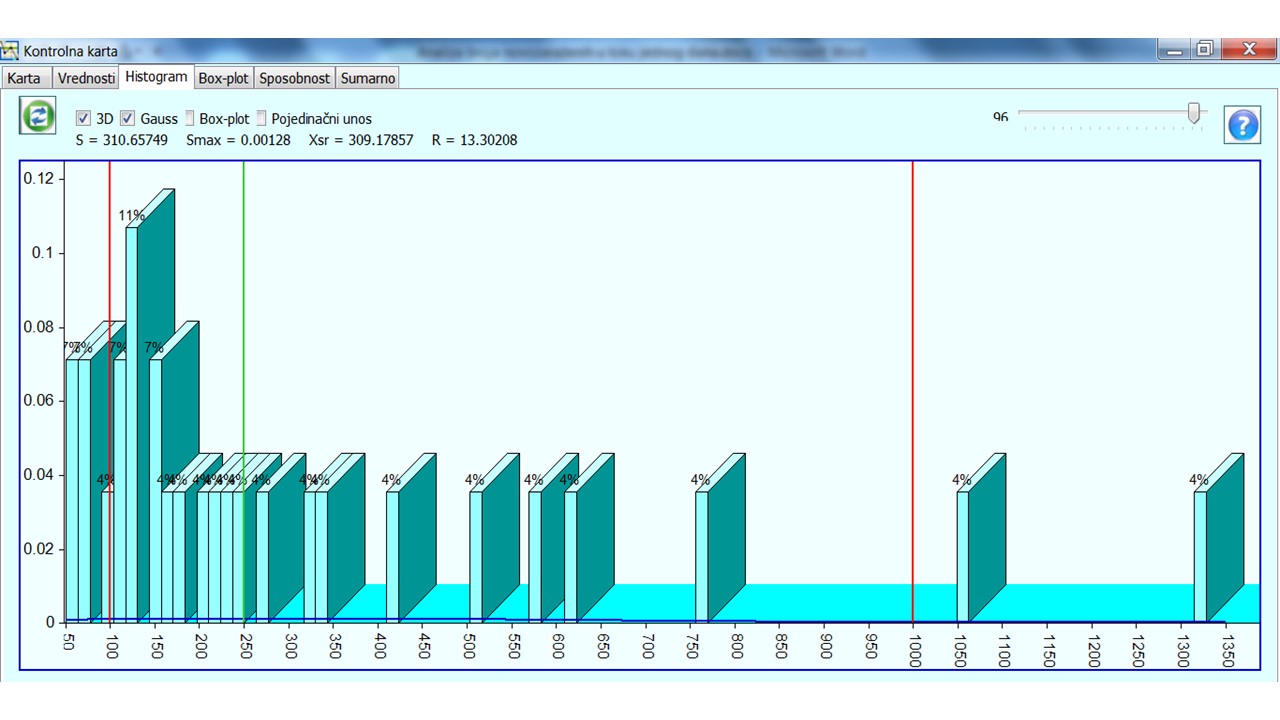
Figure 7 Histogram for the period from 06 October-28 November 2020.

Figure 8 Process capability for the period from 06 October-28 November 2020.
Figure 9 shows a summary of all analyzes for the period from 06 October-28 November 2020.
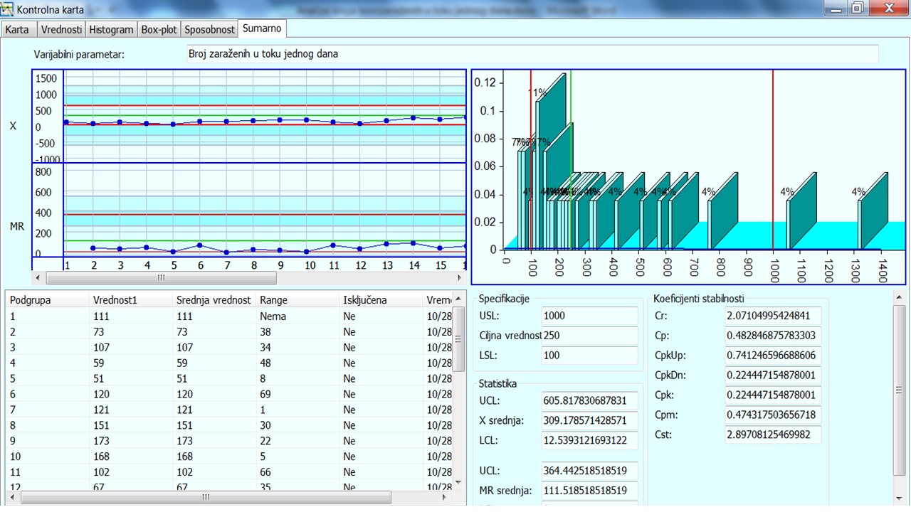
Figure 9 Summary of all analyzes for the period from 06 October-28 November 2020.
Analysis of variation in the process of occurrence of positives in the period from 06 October to 28 November 2020 shows that the ability of the process decreased significantly (Cpk = 0.22444) compared to the value for the period from 12 September to 05 October 2020. This means that there was a worsening of the process of occurrence of positives, ie that there are larger variations, but also the values of the number of positives in that period by days.
For such an unstable process, it is necessary to determine the roots of the cause. Epidemiologists most often state one of the causes, irresponsible behavior of citizens. Epidemiologists use the so-called “Epidemiological Curve” as a basis for such conclusions. This curve, for the considered period in Serbia, is shown in the figure 10.
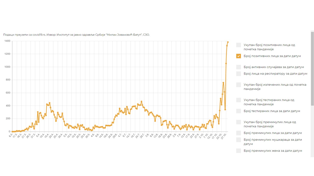
Figure 10 Epidemiological curve for the considered period
The presented analyzes referred to the number of positive ones during one day in the whole of Serbia. The data for such analyzes can be misleading because it is unlikely that in all places in Serbia the picture is the same in one day. There are probably places where the number of positives is significantly higher than the average, as well as places where that number is significantly lower than the average for the whole of Serbia. That is why it would be better to have data by places in Serbia. In that case, control cards would be obtained for each place, as well as the ability of the process of appearance of positive citizens during one day.
The process of positive appearance can be improved (only at the level of observing the characteristics of the process) with the Improvement of the process of clinical-biochemical laboratory diagnostics, which is realized in the Center for Medical Biochemistry. The Center for Medical Biochemistry serves 25 KCN clinics (Clinical Center Nis), as well as other secondary health care institutions from the area of Southeast Serbia. The Center for Medical Biochemistry analyzes several hundred biochemical markers, and about 2,000,000 different biochemical analyzes are performed annually. The results of biochemical laboratory diagnostics are very important for establishing a correct diagnosis for patients, as well as for a positive outcome of their treatment..
By monitoring the number of received samples from individual clinics (in this case, it would be monitoring the number of positive in some places in Serbia in the same period) and their analysis using Pareto diagrams, it is possible to identify a vital minority, ie clinics from which most samples come for testing. for a certain period of time (in the process of the appearance of positive ones, this would make it possible to single out a critical minority of places in Serbia where the worst situation is in terms of Covid 19).
Figure 11 shows a Pareto diagram of sampling from KCN clinics over a 30-day period.[1]
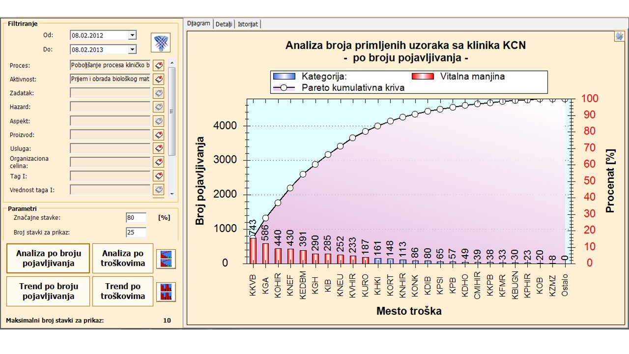
Figure 11 – Pareto diagram of sampling from clinics KCN
From this diagram, it can be seen that from 10 out of 25 clinics 80% of all samples arrive during the day (red bars on the Pareto diagram). The clinics from which the largest number of samples arrive are:
- Clinic for Cardiovascular Diseases – KKVB
- Clinic for Gynecology and Obstetrics – KGA
- Clinic for General Surgery – KOHIR
- Clinic of Nephrology – KNEF
- Clinic for Endocrinology, Diabetes and Metabolic Diseases – KEDBM
- Clinic of Gastroenterology and Hepatology – KGH
- Clinic for Infectious Diseases – KIB
- Clinic of Neurology – KNEU
- Clinic for Vascular Surgery – KVHIR
- Clinic of Urology – KURO
In the same way, a vital minority of places in Serbia that are critical on the issue would stand out Covid 19.
As data on places in Serbia are not available, the analysis based on existing data continues here. For the total data presented at the level of Serbia, it can be said that the conclusions of the Epidemiologist should and can be accepted. However, there are probably other causes that lead to this process. Therefore, the following is a possible root cause based on the application of the Ishikawa method.
Ishikawa diagram for a large number of positives
Ishikawa diagram is a tool that helps identify, classify, and display the possible causes of a particular problem, quality characteristic, aspect, or hazard. The diagram graphically shows the relations between a certain consequence and all categories/factors that affect it. This diagram was invented by Kaoro Ishikawa. Because of its appearance, this diagram is often also called a fishbone diagram.
The goal of the Ishikawa method is primarily to systematize knowledge. Through the research of influencing factors on a consequence, knowledge about it is crystallized and collected, and that facilitates the analysis. The Ishikawa diagram is also known as the cause-and-effect diagram.[2]
Ishikawa diagram is a tool used to consider and show the relationship between a given consequence and its potential causes. Several potential causes are grouped into main categories (usually according to the 7M principle) and subcategories so that their visual representation resembles a fishbone..
Diagram creation is performed in several steps:
- Identify and clearly define the consequence to be analyzed
- Draw a “spine” and create a field of consequences
- Define the main causes that affect the consequence under consideration
- For each of the main branches, identify other specific factors that may affect the consequence under consideration
- Identify more detailed levels of causes and continue to organize them related causes or categories at lower levels
- Analyze the diagram
The categories / factors considered under the 7M principle are:
- Man
- Machine
- Material
- Method
- Management
- Measure
- Milie)
For the analysis of the causes in this case, the following categories will be used, which influence the appearance of positive citizens Covid 19:
- Citizens (man)
- Medical equipment (machine)
- Medical material (material)
- Method (test method)
- Management (crisis management)
- Measurement (how many citizens are tested on a daily basis)
- Environment (micro, macro, and in the region)
The author of this article conducted a personal analysis of this process. An incomplete analysis of the root cause using the Ishikawa diagram is shown in figure 12.
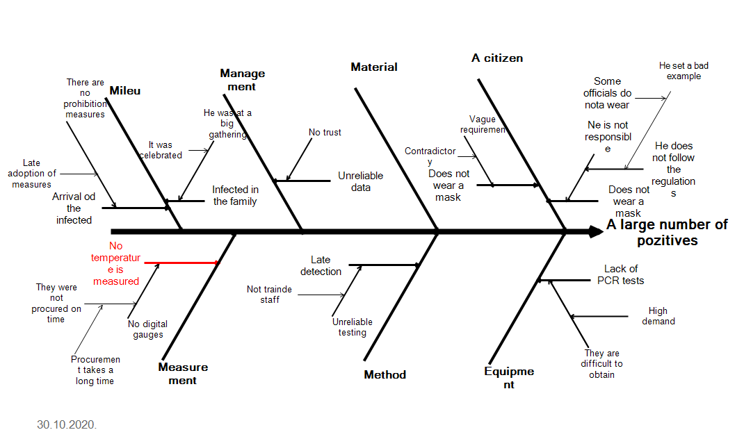
Figure 12 Ishikawa diagram for a large number of positives
To get to all the possible root causes of the emergence of a large number of positive people leading the pandemic monitoring can and should organize a Brainstorming session and investigate all possible causes. The same cause can occur in more than one category. These are the causes for which corrective measures should first be determined in order to reduce the number of positive ones.
Here, in principle, the procedure is shown on how to apply Lean tools in order to stabilize and improve the process of occurrence of positive on Covid 19, ie how to continuously reduce this number and eventually lead to a state in which there are no more positive.
At Nis, 30.10.2020. Prof.dr Vojislav Stoiljković
[1] Vojislav Stoiljković, Lean u zdravstvu, www.cimlss/knjige
[2] Vojislav Stoiljković, Lean in Healthcare, Lambert, 2018.


